Welcome Email Series Redesign
Welcome Email Series Redesign
Email Design | UI/UX
CLIENT
The Grommet is an eCommerce platform that launches undiscovered products and supports local makers and small businesses.
BRIEF
The Welcome Email Series needed to be updated as part of a brand refresh. As the sole designer on the project, I collaborated with the marketing team to define the new content, modified the UX to remain consistent with the new site, updated the UI look and feel, and tested each email for quality.
SOLUTION
This project was the start of a larger initiative that would later involve redesigning and optimizing the entire B2C email program. I started with auditing all the marketing emails the company was sending at the time. To set up the team up for success, I researched responsive email design best practices (font choice/size, email width, image size,..) and communicated my findings to make sure we were all adhering to the same standards.
OUTCOME
A cohesive Welcome Email Series that introduced the new brand, reinforced the brand messaging, and was consistent with the site’s user experience.
ROLE
Designer
TOOLS
Adobe Photoshop, Adobe Illustrator
DELIVERABLES
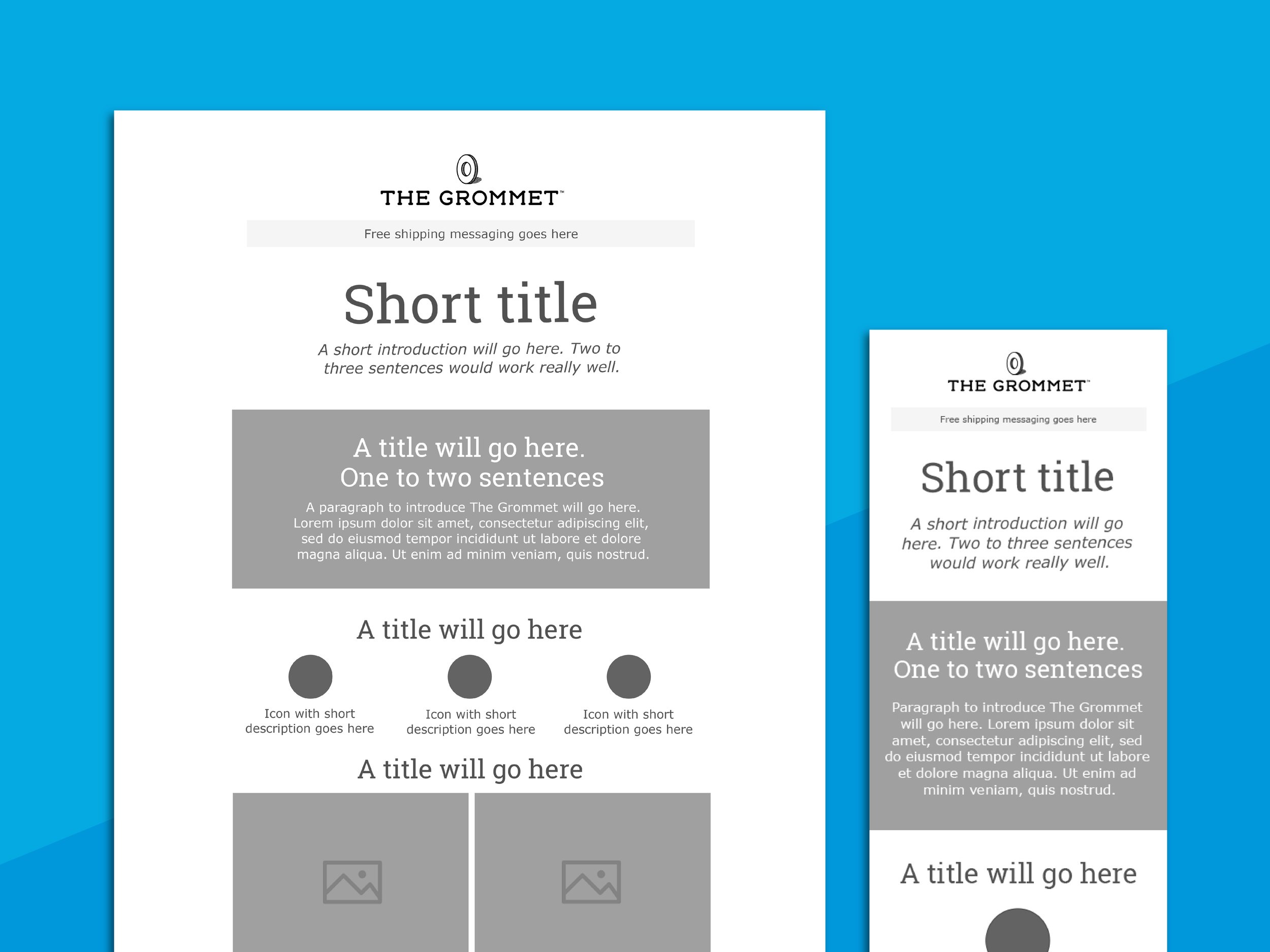
Low-fidelity wireframes
High-fidelity layouts
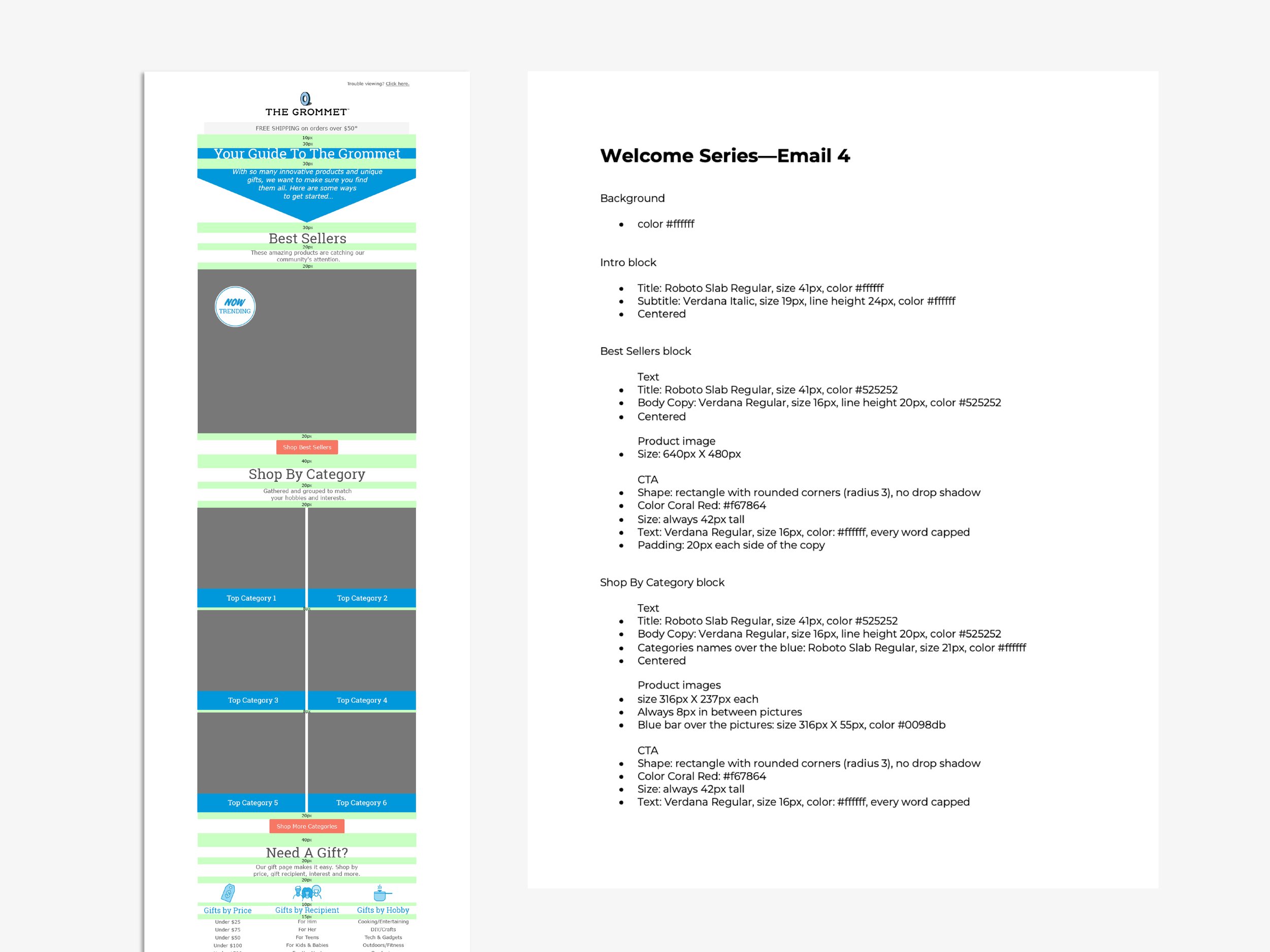
Specs and conventions document
Creative Director: Stacey Bakaj
Copywriter: Christine Wright
Photos/Client: The Grommet

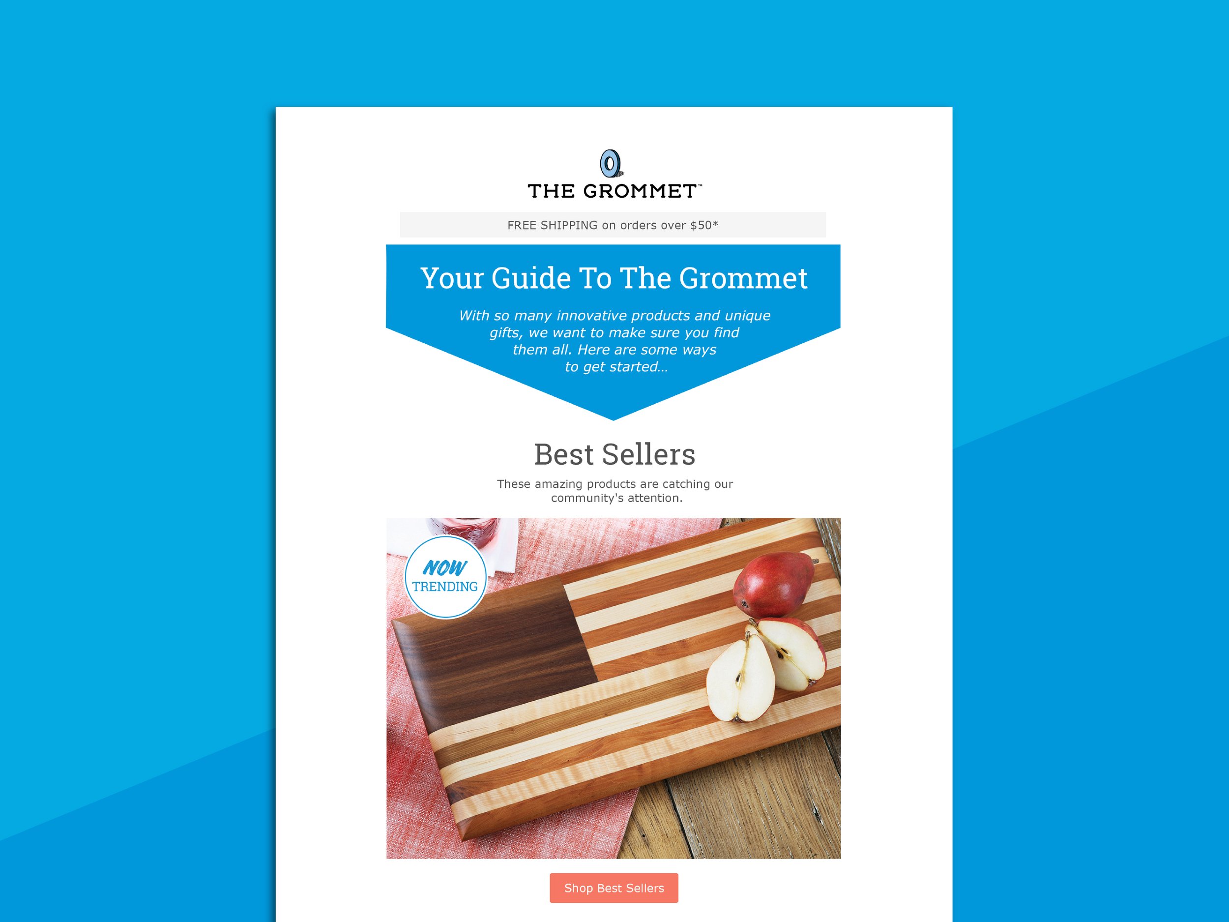
High-fidelity layout—Email 1
Icons designed by Lauren Hastings

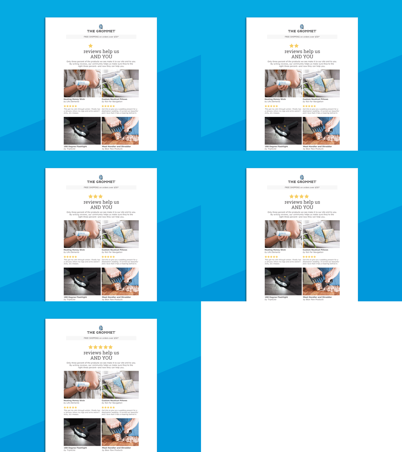
High-fidelity layout—Email 2

High-fidelity layout—Email 3

High-fidelity layout—Email 4

High-fidelity layout—Email 5

Low-fidelity wireframes

Marketing Email Audit
The audit revealed many inconsistencies in CTA button shapes, fonts, colors, spacing, and design elements.

Specs
To ease the Listrack implementation, I provided detailed specifications for each email.