Brand & Website Refresh
Brand & Website Refresh
Visual Identity | UI/UX
CLIENT
Vicinity Energy is the largest district energy provider in the United States.
BRIEF
Revitalize Vicinity’s visual identity, website, and marketing materials.
SOLUTION
Vicinity’s previous visual identity was too minimalist and lacked flexibility for creating visual assets. To solve for this, I enhanced the color palette, introduced new graphic elements, and developed a cohesive icon and illustration style.
The original site’s limited components resulted in repetitive pages. There was also a need for a more consistent design system. I designed a wide range of responsive components the marketing team could choose from to build new web pages, along with a design system. I collaborated with the director of marketing and lead copywriter to create over 50 high-fidelity layouts, then worked closely with developers to implement the components.
OUTCOME
A versatile visual identity and a well-structured, device agnostic website emphasizing clear visual communication, ensuring a consistent and engaging user experience.
ROLE
Senior Designer
TOOLS
Figma, Adobe Illustrator, Adobe Photoshop, Adobe InDesign, Microsoft PowerPoint, MarkUp
DELIVERABLES
Brand guidelines
Pattern library, icon set & illustrations
Low-fidelity mockups
High-fidelity layouts
Component library
Design system
Marketing templates & materials
Creative Director: Sara DeMille
Copywriter: Bella Pace
Web Developer: Adam Hoyle
Client: Vicinity Energy

LOGO & BACKGROUND COMBINATIONS

ABSTRACT PIPE & DOT PATTERNS

PHOTOGRAPHY STYLE

ICONOGRAPHY

ILLUSTRATIONS

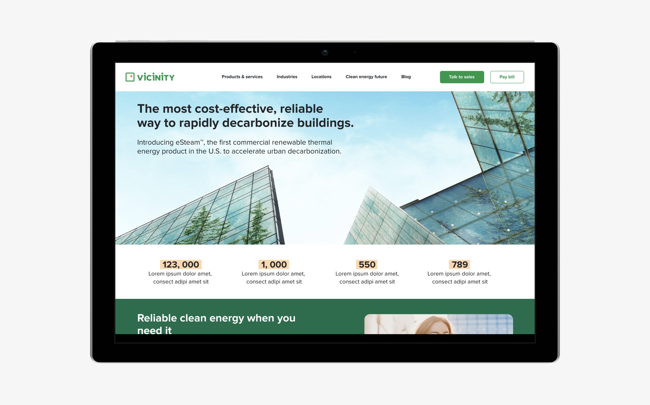
HIGH-FIDELITY LAYOUTS—HOMEPAGE

SCROLLABLE HIGH-FIDELITY LAYOUT—HOMEPAGE

A FEW OF THE COMPONENTS

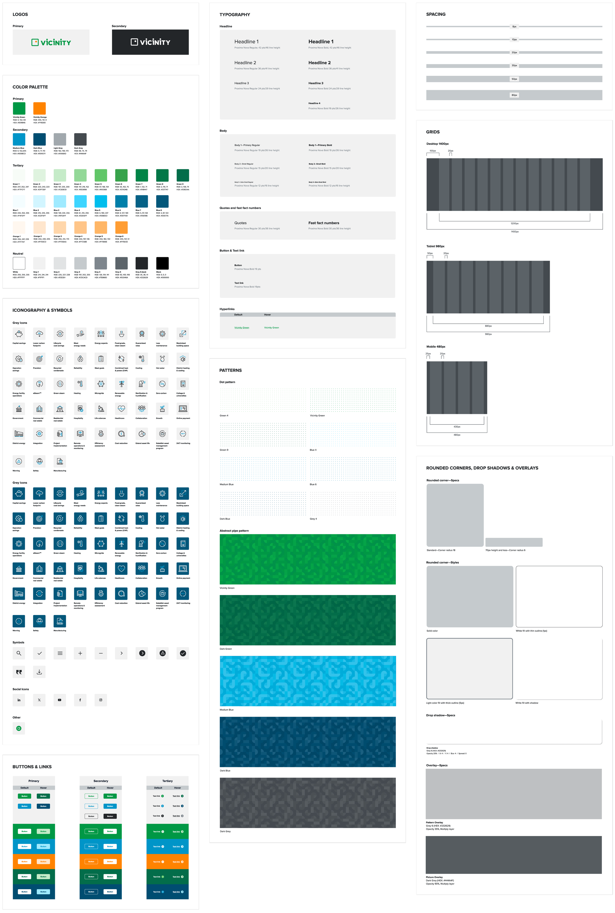
DESIGN SYSTEM

INFOGRAPHIC

PROMO LETTER

POSTER

FACTORY TOUR DIAGRAMS

SOCIAL ADS

UNDER CONSTRUCTION SIGNAGE

VAN WRAP
(this concept ultimately wasn't picked)

OLD WEBSITE AUDIT